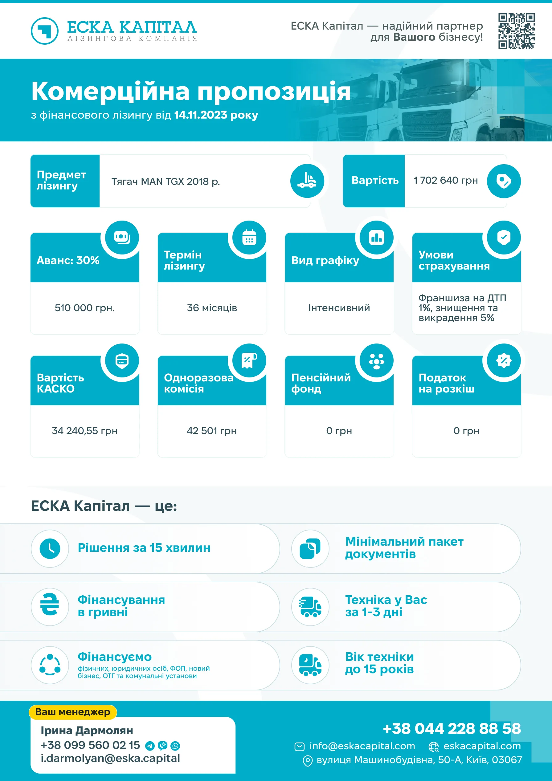
ESKA Capital had to update the design of the commercial offer templates for each line of business of the company, which was generated in the CRM system, in accordance with the desired machinery.
For this design, I chose the path of step-by-step improvement of each of the blocks. The client also wanted to reduce the number of pages to two.

The key flaws, in my opinion, were:
- unclear icons for each of the miscalculation points
- the benefits that were located on the second page (would the reader have read it?)
- difficulty in finding contact information
- inappropriate photos of people and machinery
So, in the final result, all these issues were resolved, the contacts of the company and the manager who takes care of the client were indicated at the bottom of each page, and the design became more streamlined and consistent with the new style of the company.
The result is here: